


.png)


.png?width=171&height=239&name=2025%20Trends%20Report%20Nav%20(1).png)


Forecasts (or projections) of future demand for specific healthcare services are a critical component of any healthcare organization’s strategic planning process. Unfortunately, these projections are inherently difficult to produce; they require a lot of data, the dimensionality is vast, and the input data is generally extremely noisy. Furthermore, there is no real consensus on a “best” way to produce a forecast; there are simply some entrenched methods that have been in use for decades, and a reluctance to shift away from those methods due to fear and inertia. Nobody ever got fired for buying IBM… until they did.
In this article, we will describe the demand forecasts we produce at Trilliant Health, why we think our approach makes the most sense and what we don’t attempt to forecast.
What is a demand forecast?
You would think the answer is somewhat self-evident, but the real question is “demand for what?” In broad strokes, the general answer is “demand for healthcare services,” but the details matter. Once you start to dive into any specific use case, you soon realize that the forecast must account for:
- patient age;
- patient gender;
- specific services (procedures);
- specific diagnoses;
- setting of care; and
- geography.
Including all these dimensions results in numerous forecast permutations, depending on how you break them out. Unless you only need a national model, geography is a real doozy. There are, of course, 50 states in the US, as well as 927 CBSAs, 3,143 counties and ~40,000 ZIP codes (not all of which have people living in them).
After you have decided on the dimensionality of your projection, you have to decide what you’re trying to predict! In other words, how do you actually plan on measuring demand? Is it procedures performed? Visits? Patients with a certain diagnosis? New patients seen? Readmissions? The options are almost as variable as the ICD-10 catalog of watercraft injuries.
So… you must choose something, right? What exactly are we predicting?
Correct; life is about making decisions. After many philosophical conversations, model iterations, and arguments with our CFO about cloud spending, we’ve concluded that the incident rate (IR) of a specific procedure or diagnosis is the most useful metric to forecast. The IR is simply the number of times a specific procedure or diagnosis occurs in a specified population. We forecast it as ‘the rate of X per 10,000 people’. There are several advantages to predicting a rate, but a primary one is that a rate is normalized by population, and therefore comparable across geographies. If you want to compare the IR of joint replacements for 75-year-old men in Nashville to the IR of joint replacements for 75-year-old men in New York City, you can do that. If you want to compare the IR of hip procedures to the IR of knee procedures in Nashville, you could do that, too.
You mentioned geography was a doozy. How do you handle that?
We think it is self-evident that healthcare utilization differs according to location. Obviously, demographic and population health differences can exist across geographic areas, but even holding those constant, geography can determine your healthcare utilization. Ask someone who suffers from seasonal allergies if there is a difference between Nashville, TN and Denver, CO. Or ask someone in Flint, MI what they think about their drinking water. We build forecasts at multiple levels of the geographical hierarchy — nation, state, CBSA and ZIP code. This is not trivial! We generate tens of thousands of GLMMs to project a rate for all the permutations of service utilization, demographics and locations.
Huh?
Skip this section if you’d like. For each “slice” of the dataset we would like to produce (say, hip procedures for 70–79-year-old men in an inpatient setting), we build a model that takes all geographic areas into account. We take advantage of the fact that while an IR should differ between ZIP codes, we do expect the IR for individual ZIP codes to be correlated. The GLMM learns the distribution of intercepts and slopes for all ZIP codes nationally and uses that distribution as a prior for an individual ZIP code. Similarly, we learn the distributions of all states, which are used as priors for each state forecast. The result of this is that geographies with incidence rates at the extremes (due to outliers or data scarcity) tend to get regularized towards the mean distribution.
What is a distribution?
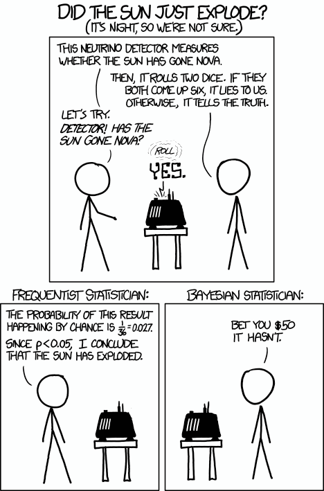
This is important! We are not generating a point prediction, but instead a probability distribution. We are not stating “there will be 100 hip procedures performed in 37212 in 2029;” instead, we are stating “there is a 75% chance between 80 and 120 hip procedures will be performed in 37212 in 2029.” That is, we are generating a credible interval that allows us to say: “given the observed data, the effect has X% probability of falling within this range.” Queue the jokes concerning frequentist and Bayesian statistics.
Where does all this data come from?
I’ll assume you have read What's in a Claim Part 1 and Part 2, right? The short answer is that we buy national datasets from multiple sources, resulting in a claims dataset that is over 100B+ rows, covering the lives of 300M+ patients (CMS and commercial, clearinghouse and payer-direct). If you have not made the investment in acquiring and cleaning the raw data, your options are fairly limited. Many existing demand forecasts simply purchase data from a single vendor (which is typically constrained to a single geographic area) and extrapolate those observed IRs out to a national forecast. For a lot of reasons, we think this is a terrible idea.
So what can I do with this data?
Well, the easiest thing to do is to show you. Below are plots for the projected national rates for Orthopedic, Heart / Vascular, Neuro / Spine and Digestive surgical service lines. Included on those plots are the actual observed values through 2022.
The above plots have all been generated with data directly output from our demand forecast, with no tweaking or fussing.
Aren’t there other factors to consider besides a change in utilization rate?
Yes. One of the most important and obvious factors is population change. We leverage public and third-party datasets to track forecasted changes in the numeric and demographic population of a specific geography. That way, we can align a specific forecasted incidence rate with a specific forecasted demographic population in a specific geographic area.
Are there any other factors? Absolutely. These “impact factors” can include technological innovation, drug development, economic and social conditions, policy changes and many others. We are data scientists, not political scientists or futurists or wizards, so we don’t attempt to guess at any of them, because it is a fool’s errand to do so. Who predicted Keytruda 10 years ahead of time? Or GPT-4, COVID-19, Amazon’s acquisition of One Medical or the TiC rule? Each of the aforementioned has had, or will have, significant effects on the delivery of healthcare.
The probability that something will happen is not the same as thinking or believing that something will happen. So, if you “trust your gut” about the long-term implications of a change — like Michael Burry did about mortgages in 2007 — then you can tailor a probability to fit your world view. For example, if you believe that changes in CMS policy will result in a specific surgery moving to the outpatient setting by 5% over the next ten years, then take the incidence rate for 2033 and multiply it by 1.05. It is simple math that everyone can perform, and we don’t believe in asking people to pay us to regurgitate their own opinions back to them. Perhaps we should, because it is what the market has been conditioned to expect over the last 40 years; it seems to give people a warm and fuzzy feeling inside…

We believe in providing our users with data that is based in evidence, not conjecture. And we believe in educating our users on how to use that data, as opposed to treating them like mushrooms.
And now you have a demand forecast!
When you start putting these pieces together, you will be able to forecast demand across the dimensionalities you have selected. You can dig into our Demand Forecast to see how our forecast compares to yours. Then, once you have an idea of what may change in the future, you can read our Field Guide to learn how to turn those data insights into strategies to compete in the healthcare economy. Happy forecasting!